Xylographism unbound
The influence of illustrated journal graphics on the
art of Vincent van Gogh.
by Alexander Roob
Only in recent years has one gained the insight that
Vincent van Gogh was not only a collector of Japanese graphic prints, like many
of his artist colleagues, but was also imbued by a passion for the pictorial
art of illustrated journals of his times. This was mainly thanks to two
exhibitions: One, in spring of 2003 in Amsterdam, was dedicated to the broad
complex of his pictorial influences,
[1]
and the other, in 2005 in The Hague, more specifically to
his collection of illustrated journal graphics.
[2]
In the catalogue of the first exhibition
it is stated that it is almost
impossible to overestimate the importance of graphic arts for Vincent van Gogh
[3]
,
but one could say that this is precisely what the editors bring about. They
illustrate the catalogue mainly with paintings of sufficiently known reference
artists, from Rembrandt to Millet to Signac, leaving for the most part to
obscurity the large complex of illustrated journal art, which Van Gogh called
his visual Bible, and the illustrateurs, whom he urgently wanted to be
treated equally in artistic terms. It is hard to avoid the impression that
research on Van Gogh – as far as its dealing with illustrated journal art
is concerned – is lagging far behind its own claims.
During his almost two-year tenure in
London as an art- trade apprentice,
[4]
during which his view of the purpose of art underwent a radical religious
change, it was above all the graphics in the big illustrated journals, the
London Illustrated News and its recently founded competitor, The Graphic,
which made a deep impression on him. It was so lasting that Van Gogh, even ten
years later, admitted to an artist friend, Anthon van Rappard: Sometimes it seems to me that there is no stretch of time between those
days and now - at least my enthusiasm for those things is rather stronger than
it was even then.
[5]
 |
 |
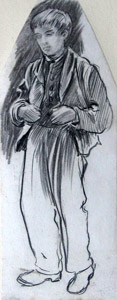
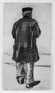
| top: Van Gogh, 1884 left: Van Gogh, 1883 >click on image for bigger view |
He was in regular exchange with his artist friend Rappard, with whom he shared his liking of illustrated journal prints. In other contexts, he met disconcertment regarding his interest in illustrated journal art with other colleagues. The board of the art cooperation of The Hague, Pulchri, turned up their nose at his offer to give an evening lecture on this topic with the argument that they didnt want to be bothered with [t]hose things one sees now and then in the South Holland café. [11] In a letter to Rappard, he complains about the condescension of the art trade and the successful artists of the works of illustrated journal graphic artists, who wanted to hear nothing of the drivel about what is called the illustrative. [12]
It was precisely the directness and the popular availability of these masterpieces one gets ... for ones 50 centimes, as he called them [13] , that fulfilled his ideal of a democratic art that crossed class borders; an Arte Povera that appeared not to be tinged with the shadow of pretension and was not subject to an elitist distribution mechanism aiming at exploitation, but that could indeed come into the publics hands and be brought within everybodys reach. [14]
The foundation phase of the illustrated journals and thus also the orientation of their pictorial art were indeed characterized by the mass enlightening and social-revolutionary spirit of the period preceding the March revolution. However, the 1870s, Van Goghs formative years, mark a turning point from the hitherto more anonymous illustrated journal graphics to artificiality. Due to new photo-technical transfer possibilities, the draughtsmen began emancipating themselves from their dependency on the guild of engravers and developed a self-awareness that increasingly stressed authorship and aimed at developing an identifiable style. This tendency was particularly pushed forward by the young publisher William Luson Thomas who attempted to challenge the monopoly of the London Illustrated News with an editorial concept that granted the visual part even more space and attached great value to the development of an expressive, artistic handwriting [15] .
The founder of Graphic was a trained xylographer himself, a student of the engraver and poet William James Linton, whose social-revolutionary professional ethics, like a ferment. effected the development of the later Arts & Crafts movement. Thomas gathered a group of artists around him, most of whom were young academy graduates who appeared predestined for fulfilling their picture reportage commissions due to their social-revolutionary artistic ambitions. Thomas, who like most of his artists was also a great admirer of the emotional social prose of Charles Dickens, confronted the draughtsmen predominantly with topics from the dark sides of Victorian society. The most vivid works of the Graphic artists were created in poorhouses, shelters for the homeless, and on the streets and markets of London.
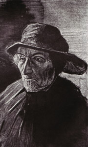
Hubert Herkomer, Blind Basket-makers, The Graphic 1871
right: H. Herkomer, Study for Blind Basket-makers, ca. 1870 (Collection MePri)
 |
 |
| Hubert Herkomer, Study, ca. 1870 (Collection MePri) |
Van Gogh, 1882 |
Especially since he read an essay by Hubert Herkomer, [19] one of the leading draughtsmen of the early Graphic, in which the author expressed discontent with the decline of the art of drawing in the illustrated journal trade, the artistic conditions in the early days of this illustrated journal appeared to him in an all but mystically transfigured way: You know I would have counted it the highest honour - an ideal, in fact - to contribute to what the Graphic started. [20]
 |
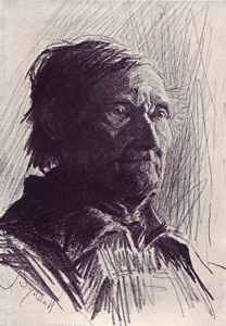 |
| Van Gogh, Portrait, 1884 | Hubert Herkomer, Portrait, undated |
I see Millais running to Charles Dickens with the first issue of the Graphic. Dickens was then in the evening of his life, he had a paralyzed foot and walked with a kind of crutch. Millais says that while showing him Luke Fildes's drawing 'Homeless and Hungry, of poor people and tramps in front of a free overnight shelter, Millais said to Dickens, Give him your Edwin Drood to illustrate, and Dickens said, Very well. Edwin Drood was Dickenss last work, and Luke Fildes, brought into contact with Dickens through those small illustrations, entered his room on the day of his death, and saw his empty chair; and so it happened that one of the old numbers of the Graphic contained that touching drawing, Empty chairs - there are many of them, there will be even more, and sooner or later there will be nothing but empty chairs in place of Herkomer, Luke Fildes, Frank Holl, William Small, etc. ... It is the same with the Graphic as it is with many other things in the realm of art [21]
5 images
 |
[22] For Van Gogh, however, this motif was connected to the very special meaning of place-holding within an ideal-socialist community of artists, to which the Graphic artists and the other social-realist illustrateurs of his collection also belonged. The desertedness of the two chairs, his own as well as that of his artist friend Gauguin, in their existential finality and inevitability, amounted to an expulsion from this community. The resulting deep despair and the tragic events that ensued rank as the most prominent building blocks of Van Goghs legend as an artist.
However, the picture world of the illustrated journal, from which he had taken this image of absence, this encyclopaedic Bible, which every artist should have ... around continually in the studio [23] , disclosed itself to him not only on the surface as an inexhaustible canon of motifs. During his many sleepless nights, in which he went through his collection by candlelight, [24] he also immersed in the structures of the printed sheets.
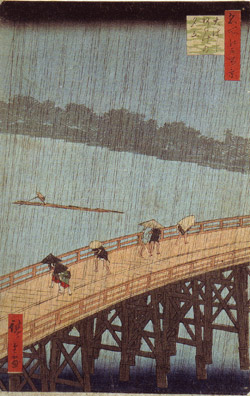
One can gather from many of Van Goghs remarks that it was not only the distributive possibilities of printing that fascinated him but that the – for him – affordable, democratic character of mass graphics connected itself with certain formal features of the techniques to form an aesthetic ideal which he placed higher than the form in which originals manifested themselves. When he writes in a letter to his brother about a newly painted picture that it looks like a chromolithograph from a cheap shop [25] , he does not describe a deficiency but a form of manifestation that he is striving for. Also the many peculiar copies he painted after Delacroix, Doré, Hokusai, Millet, and others, are not to be understood – as he often stressed – as copies in the familiar sense, where the aura of the original is adapted, but as interpretations or translations of engravings reproduced in black-and-whit; painterly versions, that is, of popular graphics. [26]
 |
 |
|
|
Van Gogh, Bridge in the rain (after Hiroshige) |
| >click on image for bigger view |
By joining Hubert Herkomer in complaining about the decline of illustrated journal graphics, [30] he also intervened in the commencing debate on the change of xylography, a debate which became more fierce towards the end of the century due to the emerging Arts & Crafts movement. Through the increasing use of photochemical transfer methods of the models to the woodblock, and the inflationary use of lining machines in the 1870s, the powerful and rustic character of the wood engravings of the early years had almost totally disappeared in favour of xylographic illustrations, which in Herlomers view mainly consisted in demonstrations of skills and effects. His admonition directed to the publishers to again attach greater importance to artistic quality instead of pure entertainment value, and his appeal to the draughtsmen to counter the tendencies of dissolution by reverting to a simpler and more honest understanding of drawing, was realized by Van Gogh, who felt himself directly addressed, in a very specific but also consistent way in that he integrated the characteristic, xylographic lineament as a structural element in his drawings and paintings.
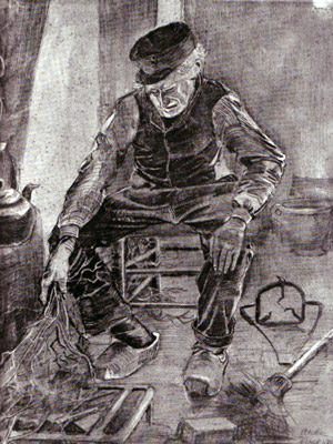
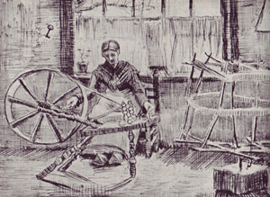
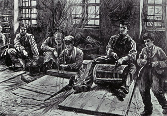
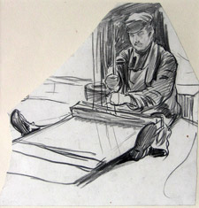
In the works of the early 1880s, he was still strongly oriented towards the style of Herkomer, Fildes and other Graphic social realists as far as the use of hatching and outline drawings was concerned. The late Van Gogh, with his dynamic, often vortex-like bundling of lines, then more and more approached a view one can describe as a wild, unleashed xylographism.
What is lacking, is a fundamental phenomenological study on the influence of xylographic structural elements, highly present in the 19th century, on the various movements of modern art – from Impressionism all the way to Futurism and kinetic abstraction. Already in the late work of Thomas Bewick, long counted as the inventor of xylography, the hatched elements become more complicated. By printing two plates upon each other, in his last engraving "Waiting for Death" (1828), he achieved a shimmering scale of graphic shadings that were hitherto never reached in print graphics. In the course of this development, which Herkomer and Van Gogh expressly disapproved of, these xylographic lineaments became ever more differentiated and refined, and detached themselves more and more from the graphic framework of objectivity. An often microscopically fine texture of undulating waves, informal vortex elements and nervous, pointillistic flickering permeated the image world of the prints in the 19th century, in a similar temporal progression as the material world revealed itself as a dense network of physical waves, vibrations and rays of all kinds. The occult, mesmerist side of the late 19th century is entangled in these fluidal xylographic fabrics, just as much as the technical-mechanical side along with its obsessions for microscopic precision engineering and chased border ornaments.
In the evolution of a dynamic-expressive xylography, Van Gogh indeed had concrete models. When they met with like-minded engravers, sheets of quite a few of his preferred illustrateurs such as Sydney Prior Hall or Paul Renouard appeared, which were characterized by highly distinct and expressive print lineaments. The works of the artist Arthur Boyd Houghton, who had also worked for Graphic for years, reveal an astonishing closeness to Van Goghs late style. Van Gogh regarded him highly and – due to the ghostly qualities of his sheets – compared him with Goya. The fact that Boyd Houghton was not even worth mentioning in the catalogue of the Amsterdam Van Gogh Museum, can be considered as an indication that research regarding the influence of wood engraving on Van Gogh has not progressed beyond purely motif-related analogies.
from"Graphic America", 1870 ( Boyd Houghton del. / Joseph Swain sc.)
16 Images
 |
The index of the collected correspondences of Van Gogh can be read as a Who is Who of those involved in international illustrated journal art of the 19th century. In regard to its achievement of systematically exploring and stylistically characterizing individual artists, it goes far beyond that which, several years later, the author and illustrator Joseph Pennell published in his survey works on the international art of illustrated journals.
In the series Van Goghs Favourites. MePri will present several draughtsmen who were especially important to the collector and artist Van Gogh: Hubert Herkomer – Arthur Boyd Houghton – Paul Renouard – Frederick Walker - Gustave Doré – Felix Regamey – Edwin Abbey & George Boughton – Georges Charles Montbard – Xavier Mellery.
In den Beständen des MePri: |
[1] Vincent´s choice: the Musée imaginaire of Van Gogh, Van Gogh Museum
Amsterdam, 2003
[2] Meesterlijk uitgedruckt- Van Goghs Haagse Prentenverzameling, Museum
Mesdag, The Hague 2005
[3] Hans Luijten, Rummaging among my woodcuts – Van Gogh and the Graphic
Arts, in: Vincents Choice,
ed. Van Gogh Museum, Amsterdam 2005
/ on the same topic: Ronald Pickvance, English Influences on Vincent van
Gogh, Nottingham,1974, Die Wirklichkeit in Black & White: englische
Holzstiche in: Matthias Arnold, Van Gogh und seine Vorbilder, Munich 1997
[4] 1873 -75
[5] Letter
R 20, February 1883
[6] A total of 21 volumes,
among them 10 volumes of The
Graphic
[7] De Hollandsche Illustratie
[8] LIllustration, Le Monde Illustré, L´Universe Illustré, La Vie Moderne
[9] Illustrirte Zeitung
[10] Harpers Weekly, Harpers Monthly
[11] Letters 184 und 240,
1882. South Holland café refers to a kind of low dive. Van Gogh interprets
the statement of the committee as a verdict on the alcoholism of both the
readers and producers of illustrated journal art.
[12] Letter R 13, October 1882
[13] Letter 406
[14] Letter 240, November 1882
[15] The originality of the scheme consisted in establishing a weekly
illustrated journal open to all artists, whatever their method, instead in
confining my staff to draughtsmen
on wood as had been hitherto the
general custom. (W.L. Thomas, The Making of the Graphic, American Review,
1888)
[16] Letter 190, 1882
[17] Letter 140, January 1881 : Now
without in the least pretending to compare myself to those artists, still, by continuing
to draw those types of working people, etc., I hope to arrive at the point of
being able to illustrate papers and books.
[18] Letter 241
[19] Hubert Herkomer, Drawing and engraving on wood, Art Journal, 1882.
[20] Letter 252
[21] Letter 252
[22] In 1889, the motif was used in the London Illustrated News on the
occasion of Gladstones resignation, for example. It originally goes back to an
illustration of Daniel Chodowiecki on Goethes Werther (1775 edition), where
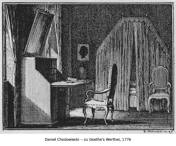
the empty desk chair is meant to symbolize Werthers suicide.
[23] Letter R 25, February 1883
[24] Letter 229, September 1882
[25] Letter
574, dated 1/28/1889. He repeatedly describes his paintings created in Arles as
pictures like Japanese prints. (letters 554
and 555)
[26] Letter 607 / 613
[27] Letter R17
[28] Letter 141.
[29] Letter R 30
[30] Letter 240, November 1, 1882